Quality in Context: Producing America's COVID-19 Data
How America's COVID-19 data was actually made — the fragmented public health infrastructure, political decisions, and reporting failures that shaped what we knew and when we knew it.
”Data might seem like an overly technical obsession, an oddly nerdy scapegoat on which to hang the deaths of half a million Americans. But data are how our leaders apprehend reality. In a sense, data are the federal government’s reality.” Robinson Meyer and Alexis C. Madrigal, in ”Why the Pandemic Experts Failed,” The Atlantic, March 2021(Robinson Meyer, 2021)
To identify and understand the strengths and shortcomings of a dataset, we need to understand how that data was made. Modern data usually does not come from a census or well-designed experiment. Datasets are often comprised of found data, or data repurposed for another use. Many of those datasets are actually convenience samples cobbled together from many different convenience samples, frequently from a variety of different data production processes. It’s essential to understand what is consistent across data producers and what is not. For example, if one state reports deaths due to COVID-19 and another reports deaths with COVID, those numbers are not perfectly comparable.1 Even something as straightforward as reporting a date is nuanced. A positive case may be associated with the date of sample, diagnosis, or onset of symptoms (Badker et al., 2021). The difference in this seemingly innocuous choice can have significant impacts on the data. To simplify, let’s suppose that one laboratory reports tests by diagnosis date and another reports tests by sample date. We’d like to know the number of tests taken on any given day, a signal of the state of the disease within the population. Under perfect circumstances, the sample date and diagnosis date would be the same.
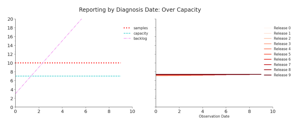
Figure 2.1. Simulation: Reporting Tests by Diagnosis Date, Over Capacity Although the shape of the curve (flat) is the same as the true number of tests, the shape is not determined by the number of tests but the capacity of the laboratory to process them. The reported data will never capture the true number of cases. As seen in Table 2, the data will look and be consistent–but it will never be accurate. For a discussion on the terms consistency and accuracy within the field of data quality, see Chapter 4. For more on the design of this shifted line plot, see Chapter 3.
But, pandemics are not perfect circumstances. Suppose that the laboratories have more samples coming in than they have capacity to process. This creates a backlog. As soon as a backlog occurs, the method of reporting, either by diagnosis date or by sample date, can dramatically change the data being reported. When things are stable and unchanging, data reported by sample date appears unnecessarily messy, inconsistent, and inaccurate compared to data reported by diagnosis date (see: Figure 2.1, Figure 2.2, Table 2.1, Table 2.2). But, a pandemic isn’t marked by stability. Neither are most critical data-driven decisions. When things begin to change, we see that the seeming advantage of
Table 2.1. Simulation: Reporting Tests by Diagnosis Date, Over Capacity When the true number of tests submitted everyday is 10, but the capacity to diagnosis tests is 7, the reported data is perfectly, consistently, inaccurate. See Figure 2.1.
| Observation : Release | 0 | 1 | 2 | 3 | 4 | 5 | 6 | 7 | 8 | 9 | TRUE |
|---|---|---|---|---|---|---|---|---|---|---|---|
| 0 | 7 | 7 | 7 | 7 | 7 | 7 | 7 | 7 | 7 | 7 | 10 |
| 1 | 7 | 7 | 7 | 7 | 7 | 7 | 7 | 7 | 7 | 10 | |
| 2 | 7 | 7 | 7 | 7 | 7 | 7 | 7 | 7 | 10 | ||
| 3 | 7 | 7 | 7 | 7 | 7 | 7 | 7 | 10 | |||
| 4 | 7 | 7 | 7 | 7 | 7 | 7 | 10 | ||||
| 5 | 7 | 7 | 7 | 7 | 7 | 10 | |||||
| 6 | 7 | 7 | 7 | 7 | 10 | ||||||
| 7 | 7 | 7 | 7 | 10 | |||||||
| 8 | 7 | 7 | 10 | ||||||||
| 9 | 7 | 10 |
Table 2.2. Simulation: Reporting by Sample Date, Over Capacity Compared to Table, 2, this data is a mess. There are daily revisions and clearly suspicious early reporting. However, when the data does stabilize, it is accurate–unlike Table 2.
| Observation : Release | 0 | 1 | 2 | 3 | 4 | 5 | 6 | 7 | 8 | 9 | TRUE |
|---|---|---|---|---|---|---|---|---|---|---|---|
| 0 | 7 | 10 | 10 | 10 | 10 | 10 | 10 | 10 | 10 | 10 | 10 |
| 1 | 4 | 10 | 10 | 10 | 10 | 10 | 10 | 10 | 10 | 10 | |
| 2 | 1 | 8 | 10 | 10 | 10 | 10 | 10 | 10 | 10 | ||
| 3 | 0 | 5 | 10 | 10 | 10 | 10 | 10 | 10 | |||
| 4 | 0 | 2 | 9 | 10 | 10 | 10 | 10 | ||||
| 5 | 0 | 0 | 6 | 10 | 10 | 10 | |||||
| 6 | 0 | 0 | 3 | 10 | 10 | ||||||
| 7 | 0 | 0 | 0 | 10 | |||||||
| 8 | 0 | 0 | 10 | ||||||||
| 9 | 0 | 10 |
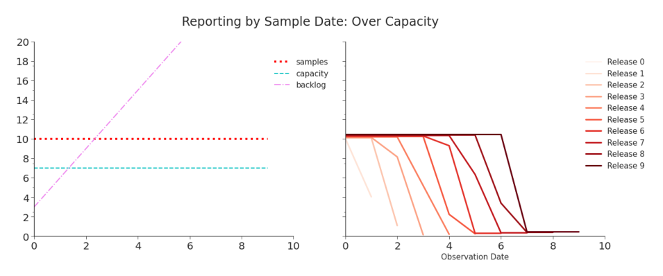
Figure 2.2. Simulation: Reporting Tests by Sample Date, Over Capacity Each day, the number of tests appears to be decreasing. But, each release restates recently reported values and eventually the data accurately captures the number of tests. As we saw in Figure 2.1, there is a trade-off between consistency and accuracy. reporting by diagnosis date quickly disappears.
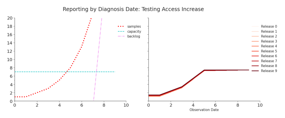
Figure 2.3. Simulation: Reporting Tests by Diagnosis Date, Testing Access Increase Reporting will reflect the increase in tests only until capacity is met, at which point the reported data will once again be dominated the capacity constraint. From then on, the data will indicate that tests (and, all else remaining the same, cases) have flattened when in reality they continue to increase. Access to testing varied throughout the pandemic, but it was extremely constricted at the beginning. When testing access increased and more people who wanted tests could get them, we expected that to appear in the data. Simulating
Table 2.3. Simulation: Reporting by Diagnosis Date, Testing Increase When capacity is met on day 5, we see an artificial plateau in the data.
| Observation : Release | 0 | 1 | 2 | 3 | 4 | 5 | 6 | 7 | 8 | 9 | TRUE |
|---|---|---|---|---|---|---|---|---|---|---|---|
| 0 | 1 | 1 | 1 | 1 | 1 | 1 | 1 | 1 | 1 | 1 | 1 |
| 1 | 1 | 1 | 1 | 1 | 1 | 1 | 1 | 1 | 1 | 1 | |
| 2 | 2 | 2 | 2 | 2 | 2 | 2 | 2 | 2 | 2 | ||
| 3 | 3 | 3 | 3 | 3 | 3 | 3 | 3 | 3 | |||
| 4 | 5 | 5 | 5 | 5 | 5 | 5 | 5 | ||||
| 5 | 7 | 7 | 7 | 7 | 7 | 8 | |||||
| 6 | 7 | 7 | 7 | 7 | 13 | ||||||
| 7 | 7 | 7 | 7 | 21 | |||||||
| 8 | 7 | 7 | 34 | ||||||||
| 9 | 7 | 55 |
such an increase highlights a difference between reporting methods (Figure 2.3, Figure 2.4, Table 2.3, Table 2.4). Reporting by diagnosis date yields consistent but inaccurate data. Reporting by sample date yields inconsistent but eventually accurate data.
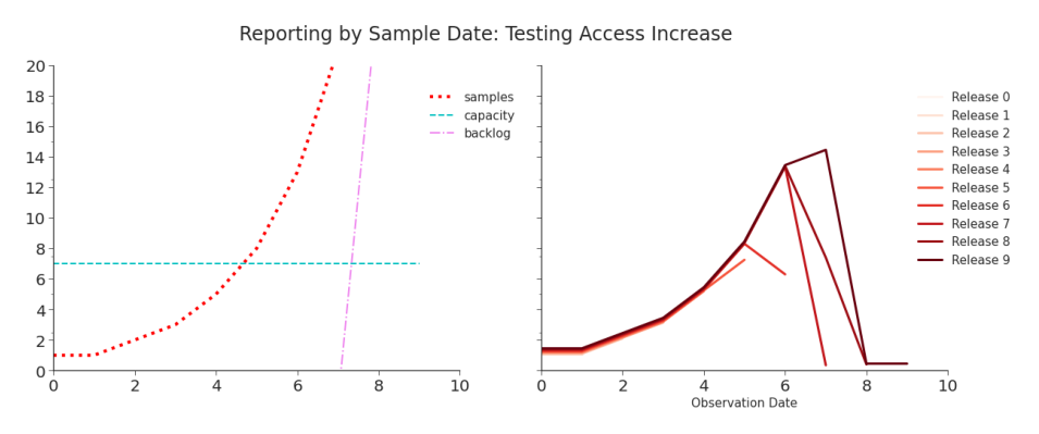
Figure 2.4. Simulation: Reporting by Sample Date, Testing Increase As in Figure 2.3, the data initially reflects the surge well. But unlike in that data, once capacity is hit an artificial decrease temporarily appears each day. Subsequent releases restate the initial values and eventually report the true values. If, instead, laboratory capacity increases, the differences in the data become far more stark. In Figure 2.5 and Table 2.5, we see that reporting by diagnosis
Table 2.4. Simulation: Reporting by Sample Date, Testing Increase When capacity is hit, on day 5, we begin to see short-term decreases in tests despite the true number of tests continuing to increase. But, data is quickly revised as the laboratory goes through its backlog.
| Observation : Release | 0 | 1 | 2 | 3 | 4 | 5 | 6 | 7 | 8 | 9 | TRUE |
|---|---|---|---|---|---|---|---|---|---|---|---|
| 0 | 1 | 1 | 1 | 1 | 1 | 1 | 1 | 1 | 1 | 1 | 1 |
| 1 | 1 | 1 | 1 | 1 | 1 | 1 | 1 | 1 | 1 | 1 | |
| 2 | 2 | 2 | 2 | 2 | 2 | 2 | 2 | 2 | 2 | ||
| 3 | 3 | 3 | 3 | 3 | 3 | 3 | 3 | 3 | |||
| 4 | 5 | 5 | 5 | 5 | 5 | 5 | 5 | ||||
| 5 | 7 | 8 | 8 | 8 | 8 | 8 | |||||
| 6 | 6 | 13 | 13 | 13 | 13 | ||||||
| 7 | 0 | 7 | 14 | 21 | |||||||
| 8 | 0 | 0 | 34 | ||||||||
| 9 | 0 | 55 |
Table 2.5. Simulation: Reporting by Diagnosis Date, Capacity Increase The data shows a consistent and highly misleading surge.
| Observation : Release | 0 | 1 | 2 | 3 | 4 | 5 | 6 | 7 | 8 | 9 | TRUE |
|---|---|---|---|---|---|---|---|---|---|---|---|
| 0 | 1 | 1 | 1 | 1 | 1 | 1 | 1 | 1 | 1 | 1 | 10 |
| 1 | 1 | 1 | 1 | 1 | 1 | 1 | 1 | 1 | 1 | 10 | |
| 2 | 2 | 2 | 2 | 2 | 2 | 2 | 2 | 2 | 10 | ||
| 3 | 3 | 3 | 3 | 3 | 3 | 3 | 3 | 10 | |||
| 4 | 5 | 5 | 5 | 5 | 5 | 5 | 10 | ||||
| 5 | 8 | 8 | 8 | 8 | 8 | 10 | |||||
| 6 | 13 | 13 | 13 | 13 | 10 | ||||||
| 7 | 21 | 21 | 21 | 10 | |||||||
| 8 | 34 | 34 | 10 | ||||||||
| 9 | 12 | 10 |
date can yield a completely different trend than the true one. And, the true trend will never be captured. In Figure 2.6 and Table 2.6, we see a mess of data that, when first reported, is highly misleading but quickly corrected. Although it takes time, the underlying trend is eventually reported. These simulations consider only a small part of the data production process. An individual needs to either want to get tested or be required to be tested. In
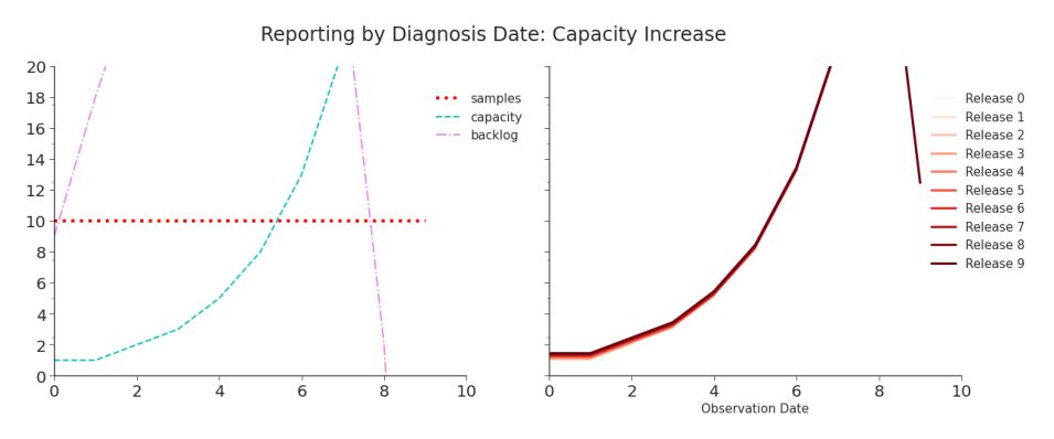
Figure 2.5. Simulation: Reporting by Diagnosis Date, Capacity Increase When capacity is lower than the number of tests coming in, it creates a backlog. Even after capacity increases past the volume of daily tests, the laboratory must work through the backlog. This means that the artificial surge that reflects the capacity increase continues even after capacity surpasses daily tests. The apparent surge is due to nothing but the increased capacity of the laboratory to diagnosis tests. As seen on the left hand side, the number of tests taken per day has remained perfectly flat. the former case, they may be symptomatic (and recognize the symptoms) or have known exposure. In the latter, they need to be involved in an activity that requires testing. In both cases, testing needs to be both available and accessible to individual. When testing was restricted, the individual needed to qualify for a test. Once a sample is taken, the laboratory must process it or the individual must perform the at-home test properly. They then must report the data to a public health agency, governmental body, or other reporting group.2 Reporting could have been done through one of many different systems (see Figure 2.7). That group then curates and reports that data, possibly to another organization, before it becomes public. Finally, the team at JHU CSSE collects the data from the many different reporting sources, curates it, and publishes their curated version of the data. This all happened almost everyday for the duration
Whether or not the results of an at-home test are reported is also likely dependent on both the individual and the result.
Table 2.6. Reporting by Sample Date, Capacity Increase Although the initial values are effectively meaningless, the final data correctly captures the true trend in testing.
| Observation : Release | 0 | 1 | 2 | 3 | 4 | 5 | 6 | 7 | 8 | 9 | TRUE |
|---|---|---|---|---|---|---|---|---|---|---|---|
| 0 | 1 | 2 | 4 | 7 | 10 | 10 | 10 | 10 | 10 | 10 | 10 |
| 1 | 0 | 0 | 0 | 2 | 10 | 10 | 10 | 10 | 10 | 10 | |
| 2 | 0 | 0 | 0 | 0 | 10 | 10 | 10 | 10 | 10 | ||
| 3 | 0 | 0 | 0 | 3 | 10 | 10 | 10 | 10 | |||
| 4 | 0 | 0 | 0 | 10 | 10 | 10 | 10 | ||||
| 5 | 0 | 0 | 4 | 10 | 10 | 10 | |||||
| 6 | 0 | 0 | 10 | 10 | 10 | ||||||
| 7 | 0 | 10 | 10 | 10 | |||||||
| 8 | 8 | 10 | 10 | ||||||||
| 9 | 10 | 10 |
of the pandemic. Even this is a very simplified version of the steps that went into creating the US’s testing and cases data. The processes for creating data for hospitalizations, vaccinations, and deaths were just as complicated–and often more so.
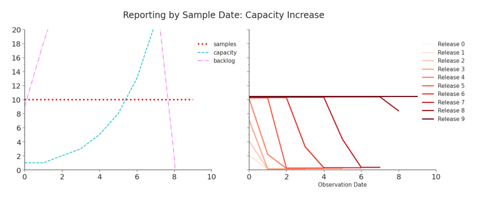
Figure 2.6. Simulation: Reporting by Sample Date, Capacity Increase When data is reported by sample date, neither the laboratory capacity nor its backlog dominate the data. Initial values are lower, but overtime they are revised. The true shape of testing numbers is captured as the backlog is processed. This is a significant advantage over what we saw in Figure 2.1, in which the true trend in testing (and, as a result, cases) will never be reported.
Any portion of the data production process might change in large or small ways over time. At any given time, details might differ from state to state, county to county, or laboratory to laboratory. To assess the fitness of our data, we need to understand what may have impacted it and how.
The First Data-Driven Pandemic
”Data are truly the engine of public health… As data grow bigger, we need better systems and strategies to manage the flow of information and ensure access to the most timely content. There are so many fast-moving, complex public health challenges that require real-time or even predictive data for public health to fully comprehend and address them. So where are we now? … we are woefully behind.” Anne Schuchat, Principal Deputy Directory, CDC (Council of State and Territorial Epidemiologists (CSTE), 2019)
COVID-19 brought us the first pandemic of the big data era. This pandemic has yielded more widely available data, at a higher resolution, and in closer to real-time than any previous pandemic (Stoto et al., 2022; Tang et al., 2021). It became our first ”data-driven pandemic” (Patino, 2020). Data-driven decision making proliferated during this pandemic (Tang et al., 2021). Governments relied on data to understand the disease’s spread, formulate effective public policy, and prepare for the future (McDonald et al., 2021). Citizens used this data to make decisions about whether or not to follow those policies. Researchers published between 100,000 and 200,000 papers on the pandemic in 2020 alone (Else, 2020). Public health data was more in-demand than it had ever been. Likewise, more was asked from the US’s public health data ecosystem than ever before (Queen and Manocchio, 2022). The last global epidemic, HIV/AIDs, began in the early 1980s. That epidemic ravaged communities decades before smart phones, laptop computers, and the internet became staples of everyday life. These technologies would eventually foster the modern expectation of immediate access to information and enable pandemic data to meet it. The data on COVID-19 pandemic was produced, it was made public, and usually it even arrived quickly. But it didn’t necessarily arrive in high quality. Governments, individuals, and researchers demanded data. They didn’t demand high quality data, but many likely assumed it. The quality of modern data is all too often assumed instead of affirmed. It’s frequently impractical for researchers to thoroughly investigate the quality of big data (Stoto et al., 2022). It’s generally not obvious that governments and individuals would need to. Although the demanded data was provided, assessing the its quality was an exercise tacitly left to the user.
Status Quo: Pre-Pandemic Public Health Data
”When I became CDC director, I was excited about making an impact on the human condition and public health. I didn’t realize I was becoming a medical historian.” Robert Redfield, on being presented 2015 data in 2018 (Armstrong, 2021)
It’s easy to imagine the digital platform for public health data in the United States. It’s a one-stop-shop for healthcare and public health professionals to share data, stay informed, and coordinate responses. Diagnostic laboratories, EHRs, and care management systems magically integrate into the backend. A seamless data pipeline automatically updates charts, retrains models, and informs real-time decisions. The system is so intuitive that even elected officials can quickly log on, understand, and support policy proposals. The reality is nothing like that. In 2018, one Kansas county public health department submitted data through roughly 85 different software programs, spreadsheets, and databases (Council of State and Territorial Epidemiologists (CSTE), 2019).3 Prior to the pandemic, the CDC offered more than one hundred distinct systems through which to report data (Council of State and Territorial Epidemiologists (CSTE), 2019). By constitutional design, states can choose their own systems for their own reporting and decide what’s required to be reported. These are not parts of one integrated platform (Council of State and Territorial Epidemiologists (CSTE), 2019). These systems are not designed to exchange data with each other. Even if they could exchange data, there is no shared data standard across clinical care, public health agencies, and the CDC (Badker et al., 2021; Council of State and Territorial Epidemiologists (CSTE), 2019). Without such a standard, significant effort is needed to make shared data usable. Of course, it is essential that data is shared. So, in the name of science and public health and despite the technology obstructing them, people have prevailed. Because there are many redundant fields required, it’s common to copy data, field by field, from one system and paste it into another (Fast, 2021; Council of State and Territorial Epidemiologists (CSTE), 2019). Not all reporting is digital, though. Many reports are still faxed (Fast, 2021). This no doubt ensures someone at the receiving end will need to manually type in data that originated in digital format. When necessary, data is exchanged over the phone (Council of State and Territorial Epidemiologists (CSTE), 2019). Some public health officials routinely drive to laboratories to pick up physical copies of bi-weekly reports. A few, with no better option, shared critical E. coli outbreak data by texting photographs of their computer screens to colleagues (Council of State and Territorial Epidemiologists (CSTE), 2019). These makeshift methods of data sharing are laborious, error prone, and quite literally dangerous to our (public) health. At this point, it’s natural to think that the top brass needs to be booted, a more technologically savvy leader put in charge, and the system overhauled. But there is no military-style chain of command in America’s public health system. No single leader has the authority to mandate broad, sweeping, transformative changes down to the lowest level. That power is vested in and divided among the states. The tenth amendment grants to the states and the people any power not specifically afforded to the federal government. Among these is the power to protect public health. As a result, each state and territory is responsible for defining its own role in public health and how it will pursue it. This has yielded fifty some different purviews of responsibility and organizational designs. Some states have centralized public health branches, but others have highly decentralized ones. Some have a balance. Administrative decisions–like what data to collect and how–are largely the responsibility of the state or local government (Staff, 1988; Wiener et al., 2003; Salinsky, 2010). The federal government may not have the power to mandate standards, but it does have the means to incentivize them (Salinsky, 2010). Public health at the federal level primarily falls under Department of Health and Human Services (HHS), which contains the Centers for Disease Control and Prevention (CDC).4 Branches of the federal government largely use funding, often in the form of grants, to encourage standardization across states. Medicaid is perhaps the best known example of a financial carrot. It is voluntary for states to join, but funding is only available for services meeting specified standards (Wiener et al., 2003). Funding is largely available on a disease-by-disease basis (Council of State and Territorial Epidemiologists (CSTE), 2019). This may enable some withindisease standardization, like data definitions (Salinsky, 2010), but it does little to standardize data across diseases. It has also has spurred the abundance of disease-specific reporting systems (Council of State and Territorial Epidemiologists (CSTE), 2019). Just as the systems were funded and built independently, improvements tend to be funded and executed in isolation (Council of State and Territorial Epidemiologists (CSTE), 2019). Public health has been chronically underfunded in the United States (Fast, 2021; Armstrong, 2021). A single standard solution, like the one that was so easy to imagine, would have required an ongoing, committed investment to public health. Instead, we have a scattering of partial and overlapping solutions. They waste the time of the data producers who often enter data, sometimes redundantly, into a myriad of different systems. They waste the time of the data curators, as they attempt to merge data of conflicting standards, formats, and origins. The American public health system simply was not designed to produce the quality of data that our modern sensibilities and models demand. Public health professionals have been outspoken about the consequences of our failing data. Nancy Krieger, a social epidemiologist at Harvard, described the importance of good data to an effective pandemic response:
You need data to do proper planning, to understand what the risk is, how the risk is changing. And you need that to be real data that are publicly available and accessible.(Fast, 2021)
When describing the US’s COVID-19 data, a high level CDC official described it as ”an absolute disaster” (Piller, 2020).
Pandemic Problems
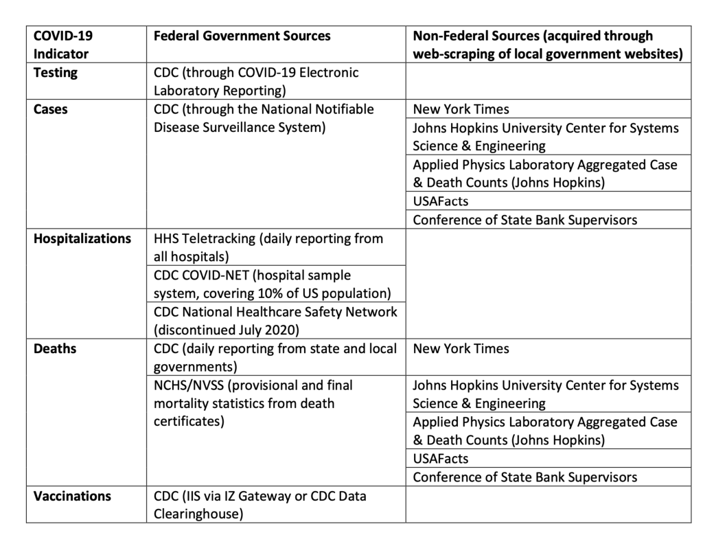
Figure 2.7. Summary of Select Government and Non-Government Data Sources as reviewed by the Office of Science & Data Policy in the issue paper ”Quality of Federal COVID-19 Data”.(Queen and Manocchio, 2022) Note This is not inclusive and, in particular, excludes ”Federal Direct Reporting,” a catch-all term for a variety of ways to submit testing data.
”Building disease-specific surveillance infrastructure is redundant and inefficient.” (Council of State and Territorial Epidemiologists (CSTE), 2019
On January 7th, 2020, Chinese authorities identified a novel coronavirus as the cause of the unknown flu-like illness that had suddenly swept Wuhan. Wuhan is the capital of Hubei Province as well as its economic hub. It boasts a well-trafficked international airport, which provides easy transport to any enterprising contagion. Within ten days of the Chinese identifying the disease, CDC officials were conducting contact tracing outside Seattle, Washington. On the 18th they took a sample and, two days later, reported it as the first confirmed case of COVID-19 in the United States. It’s unlikely this was the first case in the country, though. From the beginning, Washington state’s public health officials proactively approached the potential and eventual pandemic. The same was not true across all states. It may be common sense, but it’s also critical context: our ability to produce data on a disease is constrained by our ability to detect that disease within a population. In public health, this is called surveillance. It is the core production process for epidemiological data. If our surveillance is limited, so is our data’s ability to reflect reality.5 From the very first data point, the context of public health has governed the quality of the data. At the start of the pandemic, the newness of the disease was the context. Testing was not yet widely available and public knowledge was limited. Both circumstances likely prevented cases from being identified.
Our federated public health system has yielded federated surveillance systems. Unfortunately, these separate systems have not produced equal surveillance. During the HIV epidemic, those experiencing the worst impacts of the disease were those with the lowest quality data. The same is expected of COVID-19 (Stoto et al., 2022). Lower and middle income countries (LMICs) likely suffer more staffing and funding constraints, impeding surveillance and reporting (Badker et al., 2021). It’s been posited that COVID-19 data from LMICs is more a reflection of the ability to test for the disease than the actual prevalence of it (Lloyd-Sherlock et al., 2021). Given the highly localized design of US public health surveillance, we may expect to see the same in low-income areas of the United States. Given the extreme politicization of the pandemic, we expect to see similar trends according to politic leanings. Lower surveillance often yields the appearance of lower cases and deaths. But, lower numbers may lead to fewer resources to combat the reality of the pandemic. Certainly, more research is warranted.
Additionally, the CDC had to appear in person to sample and diagnose this case, meaning that testing was bottle-necked. It is more accurate to say that the first case in Washington state was the first recorded case in the United States. Initially, COVID-19 surveillance was constrained by design. Only samples tested by the CDC could count towards a ”confirmed positive” case. Only patients that had known exposure or had traveled to a high risk area met the CDC’s criteria for evaluation.6 These conditions could have dramatically impacted the data produced by surveillance. Let’s assume only one individual in a community traveled to a high risk area. That individual went untested but was contagious. That person could have infected a small group, none of whom would have ”known exposure.” Each infected person could likewise spread the disease, creating even more unknown exposures, and so on. The ”confirmed positive” count would miss all these cases. Fortunately, surveillance expanded. On February 4th, the Food and Drug Administration (FDA) approved the Emergency Use Authorization (EUA) PACK for a diagnostic test developed by the CDC. Two hundred test kits were distributed across the United States.7 On February 29th, the CDC removed the exposure and travel requirements for patients. That same day, the FDA announced laboratories could develop and use COVID-19 tests before the FDA had reviewed their EUA (Centers for Disease Control and Prevention (CDC), 2023a; Patino, 2020). This action dramatically expanded surveillance. David Pride of the University of California San Diego Health noted that this enabled his laboratory to develop their own test which expanded capacity from 20 tests a day to 1,000 (Patino, 2020). On March 12th, the FDA removed the requirement for confirmatory testing by the CDC. By April 22, 2020, over 40 EUAs were granted by the FDA for the development of COVID-19 test kits (Patino, 2020). When surveillance expands, we should see it in the data (Figure 2.5, Figure 2.6, Figure 2.3, Figure 2.4). With testing restrictions loosened and laboratory capacity increased, more samples were taken. With more sample taken, we expect an upward inflection in reported cases that is additive to any change in the actual disease prevalence.8 Without precise data definitions and the tracking of testing access, this increase may be indistinguishable from a surge in cases. Expanded capacity also meant that samples could be diagnosed more quickly and the backlog of samples could be reduced (Figure 2.5, Figure 2.6). The impact of this on the data was dependent on the nuanced choices of the data producers and standards they followed. Whether these changes appeared in the data as restatements or false surges depends on those nuances. When testing was no longer restricted to the CDC, it created a variety of data producers. Each laboratory or laboratory group became a data producer contributing to the whole. Suddenly, many data producers were independently making small but important decisions about how they created their data that would, eventually, be combined into a much larger data set by data curators like JHU CSSE, the CDC, and others. The CDC quickly recognized an opportunity to leverage an existing surveillance network to gather data on the growing pandemic. On March 1st, the CDC created COVID-NET to sample hospitalization data. Over 250 hospitals in 14 states9 submitted demographic and medical data on laboratory-confirmed COVID-19 hospitalizations of children and adults. These hospitals cover about 10% of the US population. However, the states covered vary significantly in their participation: 100% of the population in Maryland is covered and only 4% of Iowa. Although a helpful data point for understanding the disease, this weekly data isn’t timely or localized enough to help identify current hot spots. That would require more granular surveillance. The CDC didn’t have much power to gather comprehensive, timely, or standardized data on the pandemic. That power, along with all of public health, fell to the states. Authority is not the only motivating power, though. Money can also be a strong incentive, and it is the standard one here. On March 18th, Families First Coronavirus Response Act was signed into law. Section 1702 required state and local governments that received funding from the bill to report data to the CDC in a timely fashion (see Appendix A.1). However, that incentive was swiftly removed. On March 27th, the Coronavirus Aid, Relief, and Economic Security Act (CARES Act) became law. It repealed the requirement for states to report data to the CDC (see Appendix A.2).10 It also required all testing laboratories to report data to the Secretary of Housing and Human Services, Alex Azar, who could prescribe the requirement without the usual formalities of rule making within the federal government. As of May 6th, the guidance on the CDC website (Centers for Disease Control and Prevention (CDC), 2020b) addressed hospital laboratories only, stating
All U.S. hospital laboratories should report COVID-19 laboratory test information to their state health or local health department by following their normal protocol for reporting reportable conditions.
The guidance indicated that, via the states, the data would make it to the CDC and then to HHS. Unfortunately, as we’ve discussed, the ”normal protocol” was well-recognized to be insufficient. It is unfortunate that the CARES Act removed any accountability of the states to report accurate, timely, comprehensive, or standardized data. There was no real guidance for non-hospital laboratories, except to also continue doing what they were already doing:
CDC is working with state health departments to collect SARS-CoV2 laboratory testing data that they already receive from most clinical laboratories. CDC also receives SARS-CoV-2 testing data directly from state and local public health laboratories, a few large commercial laboratories, and its own laboratories…State public health laboratories and select large commercial laboratories that currently report directly to CDC should continue sending that data.
In effect, Alex Azar, the Secretary of Department of Health and Human Services, gave the federal government’s claim to laboratory data to the state governments and encouraged all reporting parties to go on as though it were business as usual. Although voluntary, states and local health departments had the ability to report cases to the federal government. On April 5th, the CDC and CSTE provided a standard case definition for COVID-19. The CSTE also added COVID-19 to the list of notifiable conditions in the National Notifiable Diseases Surveillance System (NNDSS) (Queen and Manocchio, 2022). At the beginning of May, 2020, a Bloomberg reporter noted that state health departments had provided more timely and complete data than the CDC. However, there remained no standard for data at the state level and data quality varied widely across the states (Patino, 2020). Although the data was produced state-by-state, the disease was not a stateby-state problem. Government officials, researchers, and the people of the United States needed a complete view of the disease, not a collection of difficult to locate and even harder to coalesce datasets. We needed one unified data set. Thus arose the unenviable but critical daily task of data curation: collecting and consolidating data from across state and local governments.
Testing
”Anyone who knows the data supply chain in the U.S. knows [getting all the data daily during a pandemic] is impossible” CDC Staffer (Piller, 2020)
The laboratory reporting guidance was opaque. For example, public health laboratories could submit data through the Public Health Laboratory Interoperability Project (PHLIP). Hospital laboratories could report through HHS Protect. Of course, some large private laboratories could continue sending data directly to the CDC. These are collectively referred to as Federal Direct Reporting (Queen and Manocchio, 2022). But, many laboratories reported to state and local governments, who in turn reported the data to the federal government. Those reporting systems might be unique to that governing body. Anyone who has ever combined data from multiple sources can already guess what a massive task this created. Depending on how you look at it, curating these disparate data sets in a timely and accurate fashion was either a Herculean or Sisyphean task. Or both. Additionally, the federal government launched COVID-19 Electronic Laboratory Reporting (CELR). It provided another option for laboratories and state health departments to report test results directly to the CDC. By April 2021, 100% of the total laboratory testing volume in the US had moved to CELR (Queen and Manocchio, 2022). More than just the technology needed standardization, though.12 What was actually reported varied across states and over time. Early in the pandemic, most states were not reporting negative test results (Patino, 2020). While testing remained constrained, strategies for who qualified for a test and who was required to be tested varied widely (Patino, 2020).13 As testing capabilities expanded, regulations around required testing evolved but access–especially during surges–was still not guaranteed. Before long, at-home testing became increasingly available. We expect that many patients who would have otherwise taken a laboratory test instead opted for the convenience of an at-home test. Unfortunately, those results of those tests are generally not captured in official reporting (Queen and Manocchio, 2022). It’s likely that as this sort of testing access increased, a smaller percentage of results were captured in the data. Since February 2020, the PCR test has been relied on to confirm cases of COVID-19. The test works by replicating the virus’s genetic material present in a patient’s sample over the course of many cycles. After a sufficient number of cycles, a positive sample should contain enough of the replicated virus for the test to detect it. By design, the sensitivity of the test depends on the initial viral load in the patient’s sample. A larger viral load will be detectable after fewer cycles than a lower viral load. Although some experts advise that stopping the test after 30-35 cycles is reasonable, many tests are run up to 40 cycles.(Galaitsi et al., 2021) As a result, the same viral load will be systematically detected by some tests and not by others, depending on the laboratories’ practices. Point-of-care NAATs and antigen test are less accurate. These are the tests often administered in schools and jails.
Cases
“[Data entry is] not our priority. Right now, our priority is in contacting people who have tested positive for COVID-19 and providing them with the education they need and identifying their close contacts. Rebecca Roesslet, Public Health Planning Supervisor in Columbia, Missouri (Fast, 2021)
With the repeal of the Families First provision, the federal government had to rely on state and local health departments to voluntarily submit cases data to the NNDSS. The option to do so became available in April 2020 along with the first interim case definitions for probable and confirmed cases (Queen and Manocchio, 2022).14 With reporting once again voluntary, health departments had to weigh their priorities: administer public health during a devastating and deadly pandemic, fulfill the critical collection and reporting requirements of their own states, or submit redundant data through a separate federal reporting system. States reported their own data to the public via dashboards, websites, and other state-specific platforms. These, of course, were neither standardized nor directly comparable. For example, at the start of the pandemic, the CDC, Texas, Pennsylvania, Georgia, Vermont, and Virginia reported viral and antibody test results together in one metric (Galaitsi et al., 2021).15 This meant that it was impossible to distinguish current infections and past infections in those states. Additionally, although the CDC had standardized its case definitions, states were not required to adopt them and those that did comply did not all done so consistently (Badker et al., 2021). Without standardization across reporting, seemingly small decisions can have an outsized impact on the data. Just as we saw when we simulated testing data, data on positive cases is susceptible to differences in reporting dates. Although most COVID-19 reports associate cases with the date of diagnosis, some associate a case with the date of symptom onset or sample collection (Badker et al., 2021). When cases are associated with the diagnosis, the laboratories’ ability to process tests, backlogs, and weekends inject another point of data degradation.
Hospitalization Data
“the debacle with the hospital data.” Nancy Cox, former director of the CDC’s Influenza Division, (Piller, 2020)
For about 15 years prior to the pandemic, hospitals had been using the CDC’s National Healthcare Safety Network (NHSN). Through it, over 37,000 healthcare facilities reported data on hospitalizations to the federal government. Producing data only 5 times a week, the NHSN was an imperfect but proven system for collecting data from hospitals (Piller, 2020). During the pandemic, however, perfection was demanded.
Deborah Birx, the White House Coronavirus Task Force Coordinator, was the one demanding it. She wanted all the hospitalization data, for every day, at the end of every day. Initially, she’d demanded that hospitals report 100% of their COVID-19 hospitalizations each day through NHSN. In April 2020, HHS introduced an alternative option for reporting: a solution produced by TeleTracking Technologies Inc (Temple-Raston and Mak, 2020).16 Few hospitals adopted the new solution and it soon became clear that the 100% goal was not being met. On July 10th, HHS announced that reporting through NHSN would no longer be an option: all hospitalizations were to be reported through TeleTracking. This change was to take effect July 15th, five days later (Temple-Raston and Mak, 2020; Glassman and Ladyzhets, 2020). Although twenty-one state attorneys general and more than 100 public health and patient advocacy groups raised concerns that this would hurt reporting, the change went through (Piller, 2020). The concerns soon proved to be merited. Despite the newer technology, many imperfections remained and some became worse. Both NHSN and TeleTracking required mostly manual data entry, without no integration into a hospital’s Electronic Health Record (EHR) system. Even with Teletracking, some facilities still faxed or emailed spreadsheets to HHS, as they had previously done with the CDC. The switch to TeleTracking increased the reporting lag to 3-4 days (Piller, 2020). In the month following the change, unexplained jumps, drops, and incongruencies began to appear in federal data. For example, HHS consistently reported three times as many hospitalization in Arkansas than the state itself did.
In six other states, HHS data was an average of 150% higher that the statereported hospitalizations (Glassman and Ladyzhets, 2020). The TeleTracking system showed more than 15,000 beds occupied in just one hospital. (The American Hospital Association lists just under 1,000,000 beds in the entirety of the US (American Hospital Association (AHA), 2022; Piller, 2020).) Even with the errors, the move to TeleTracking was not able to spur 100% reporting. Birx relented, somewhat. In September she reduced the set of required fields for 100% reporting. In October, she returned to more common method of federal data gathering: financial consequences. Together with Seema Verma, the Medicaid Services Administrator, Birx introduced a penalty for reporting shortfalls: hospitals that failed to comply with reporting requirements would be disqualified from Medicare and Medicaid reimbursements.17 One CDC staffer captured the professional zeitgeist succinctly: ”Good f—ing luck getting hospitals to clean up their data and update daily” (Piller, 2020). California, Idaho, Missouri, South Carolina, Texas, Wisconsin, and Wyoming all attributed challenges in their own hospitalization reporting to the changes introduced for federal reporting (Glassman and Ladyzhets, 2020).
Deaths
Death counts have become the unfortunate subject of controversy in the US. Critics claimed that death counts were intentionally inflated while most public health professionals agree that the reported numbers were actually lower than the true counts. Sara Auld, MD, a critical care physician at Emory University Hospital Midtown, commented on the impact of the controversy: “When people suggest that we are misrepresenting the losses and deaths from COVID, not only does it disrespect our hard work as healthcare providers, it also disrespects the families who have lost loved ones” (Boyle, 2021). The issue has become so highly politicized that the data can become divorced from the grim reality that they represent (Figure 2.8). Some of the controversy arose from the method of counting. At the start of the pandemic, Birx said “If someone dies with COVID-19, we are counting that as a COVID-19 death” (Boyle, 2021). Soon, people claimed that the numbers were padded with clearly unrelated deaths, like automobile accidents in which a victim happens to have covid.

Figure 2.8. Bodies of the deceased were stored in refrigerated trucks when COVID-19 overwhelmed New York City’s morgues. Gregg Vigliotti for The New York Times (Kliff and Bosman, 2020). The attribution practice was clarified before long, but the claims remained (Boyle, 2021). However, the difference between deaths with COVID-19 and deaths from COVID-19, as either the main cause or an accomplice, continued to differ at the state level (Boyle, 2021; Nguyen et al., 2022). State reporting suffered further issues as well. With no public reporting guidance from the federal government, states defined their own standards. The primary differences between states’ definitions were whether death certificates alone are used and whether a positive PCR test was required (Nguyen et al., 2022).18 Beyond the impact of definitions, many COVID-19 deaths simply do not have the opportunity to be counted. At the start of the pandemic, the dead did not get priority for the scarce tests (Boyle, 2021; Kliff and Bosman, 2020). The official count is also likely to miss COVID-19 deaths that occur at home, many of which went untested (Boyle, 2021; Kliff and Bosman, 2020). Excess mortality19 remains a preferred indicator of the true toll of COVID-19, but it is often finalized only at the end of the following year. It indicates that all states have undercounted COVID-19 deaths (Nguyen et al., 2022). Because the federal government’s numbers were built off the states’, federal data likely undercounted deaths, too. Finally, reporting data takes time. The reporting lag for deaths was estimated to be up to 8 weeks (Queen and Manocchio, 2022). So, we expect revisions of up to two months–and we might be suspicious of any death counts that were
Vaccinations
“It’s not because the states are not sharing those data with us. It’s because the states don’t have those data themselves.” Paula Yoon, CDC (Fast, 2021)
“useless.” White House Official, describing CDC’s child vaccine data (Armstrong, 2021)
By 2021, the vaccine rollout had begun. Soon after, data quality issues arose. Vaccination numbers conflicted between state reporting and the CDC. The CDC reported millions more vaccinated20 than states were reporting (Armstrong, 2021). Data concerns were not limited to disagreements between state and federal data. For instance, California’s data told the story of a slow and sputtering rollout. The state’s healthcare workers insisted immunizations were moving swiftly. Eventually officials discovered that data was simply missing from their records. The culprit was an easy-to-miss but critical final step in the reporting process: a scroll-to-see submit button. After discovering the issue, officials messaged healthcare workers and the data soon reflected the experience on the ground. Indeed, once the data was in, it was clear that immunizations were moving swiftly (Armstrong, 2021).
The Data We Used
”…were it left to me to decide whether we should have a government without newspapers or newspapers without a government, I should not hesitate a moment to prefer the latter. But I should mean that every man should receive those papers & be capable of reading them.” Thomas Jefferson (Jefferson, 1787)
Data is built from the ground up. In America’s public health system, the ground floor is a federated collection of independent state and local officials. Given the piecemeal and patchwork design of the public health system in the United States, producing great data was always going to be a tremendous challenge. Journalists and non-governmental groups quickly attacked this daunting challenge. The Atlantic’s COVID Tracking Project, USAFacts.org, The New York Times, and Johns Hopkins University are just a few organizations that provided data for individuals, researchers, and even the government to use. In fact, in early 2020 The White House’s Testing Overview Opening Up America Again included data from the Atlantic’s project (Robinson Meyer, 2021; The White House, 2020)(Figure 2.9). HHS Protect, a platform for sharing health care data, ingests New York Times Covid data, Johns Hopkins University Center for Systems Science and Engineering, Johns Hopkins University Applied Physics Lab (JHU APL) Aggregated Cases and Deaths Counts, USAFacts, and the Conference of State Bank Supervisors, in addition to data reported to the CDC. JHU APL was HHS Protect’s preferred source for case and death estimates (Queen and Manocchio, 2022). Unfortunately, regardless of their valiant efforts, data curators cannot overcome the quality issues that are created during data production (Stoto et al., 2022). Far from being overcome in the aggregation, local-level data issues continue on into their federal data composites (Queen and Manocchio, 2022). Each data producer suffers its own constraints, creating its own data quality concerns. But even perfect local-level capabilities would not create perfect aggregate data. Without clear coordination and comprehensive participation, independent data producers will create a series of quietly incompatible decisions that yield only superficially amenable data sets. It is no surprise then that America’s COVID-19 data has been observed to be biased, incomplete, and temporally discontinuous (Stoto et al., 2022; Galaitsi et al., 2021). Fortunately, data doesn’t need to be perfect to be useful. Data only needs to be fit for its use.
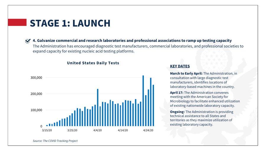
Figure 2.9. In May 2020, the White House introduced “Testing Overview: Opening Up America Again” plan. In it they reproduced a plot from The Atlantic’s COVID-19 Tracking Project (The White House, 2020; Robinson Meyer, 2021).
Notes
-
In the times since the opening quote was made, deaths due to COVID-19 in the US has exceeded 1 million.
-
Christine Steward, Health Protection Director of The Sedgwick County Health Department (SCHD) in Wichita, Kansas noted these results from an internal 2018 survey in Council of State and Territorial Epidemiologists (CSTE) (2019).
-
Although many other federal groups and individuals are highly influential as well (Staff, 1988).
-
The first U.S. case was indeed detected in a patient returning from Wuhan. Unfortunately, “untrustworthy results” were quickly reported (Queen and Manocchio, 2022).
-
We’ll refer to this as a non-retroactive change.
-
California, Colorado, Connecticut, Georgia, Iowa, Maryland, Michigan, Minnesota, New Mexico, New York, Ohio, Oregon, Tennessee, and Utah.
-
Like laboratories, nursing homes would soon face federal reporting requirements. On May 8th, Centers for Medicare & Medicaid Services (CMS) began requiring nursing homes to report cases on a weekly cadence. Prior to this, reporting was optional (Queen and Manocchio, 2022; Centers for Disease Control and Prevention (CDC), 2023b).
-
By the end of July, HHS expanded laboratories to “All COVID-19 testing sites” and required that all test results be reported within 24 hours of completion (Centers for Disease Control and Prevention (CDC), 2020a). Data, however, would still have to be reported through local public health departments or states before it became public.
-
Even PCR testing has raised standardization concerns. The polymerase chain reaction (PCR) test, also known as the laboratory-based Nucleic Acid Amplification Test (NAAT), is the most reliable COVID-19 test (Queen and Manocchio, 2022). Since February 2020, the PCR test has been relied on to confirm cases of COVID-19. The test works by replicating the virus’s genetic material present in a patient’s sample over the course of many cycles. By design, the sensitivity of the test depends on the initial viral load in the patient’s sample. Although some experts advise that stopping the test after 30-35 cycles is reasonable, many tests are run up to 40 cycles (Galaitsi et al., 2021). As a result, the same viral load will be systematically detected by some tests and not by others, depending on the laboratories’ practices. Point-of-care NAATs and antigen tests are less accurate.
-
Although symptomatic patients, healthcare workers, and individuals at high risk for exposure were often given preference (Queen and Manocchio, 2022).
-
In an August update, suspected cases were defined and the probable cases definition was edited. In 2021 a clarification to the probable cases definition was also made. Molecular amplification tests (most commonly, PCR) were required for confirmatory testing until 2021 when genomic sequencing became an option. Corrected May 2020.
-
TeleTracking is a private contractor and this was their first major federal contract (Temple-Raston and Mak, 2020). Teletracking had been awarded the contract to develop a system in the fall of 2019, through a controversial HHS bidding process that would later be the subject of a Senate inquiry and investigative reporting (Temple-Raston and Mak, 2020; Piller, 2020).
-
Birx had a history of financially incentivizing strict data reporting requirements, with mixed data quality results. See Piller (2020) for a deeper discussion.
-
Additionally, several states counted deaths of nonresidents that occur in the states while others did not (Hassan and Cahalan, 2022).
-
The deaths that exceed the predicted deaths under normal conditions.
-
Here, vaccination refers to having received at least one dose.