Visualizing the Problem
Standard line graphs hide how data changes over time. Shifted line plots, filtered heat maps, lag plots, bifrost plots, and impact plots — a visualization toolkit for data that revises itself.
In the Prologue we explored a few challenges in the JHU CSSE dataset through common visualizations, like line graphs (Figure 2) and small multiples (Figure 4). Although they were helpful with those selected anecdotes, these visualization begin to fail quickly under the pressure of daily releases. To visually balance both the scale of releases and their repetitive nature, we’ll need to get creative.
Shifted Line Plots
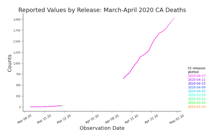
Figure 3.1. Line Plot: Cumulative Deaths in CA, March-April 2020 Although all the releases from March 1st through April 30th are plotted, that fact is hidden in a standard line graph.
On a standard line graph, one month of releases would be roughly thirty lines. That’s too many lines on one graph. When a graph is overloaded, we often transition towards small multiples. Although often an effective option, thirty multiples is too many multiples. Fortunately, releases are rife with repetition.
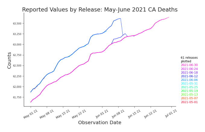
Figure 3.2. Line Plot: Cumulative Deaths in CA, May-June 2021 Disagreements between releases are evident on a line graph but when the disagreements began is lost. In many cases, as in ours, releases contain few revisions relative to the number of observations being reported. This redundant reporting brings an abundance of order to an overburdened plot. When the releases are in agreement, the lines are stacked directly atop each other, indistinguishable from a single line to the reader (Figure 3.1). When they disagree, only the deviations are visible, with no view into how or when they occurred (Figure 3.2). Missing values are only visible on the plot if all subsequent releases also have these values missing (Figure 3.1). We can learn some things from line plots, but certainly we’d like to learn more about our releases than they can teach. We propose shifted line plots to explore trends across releases and within releases simultaneously. They’re built by plotting the earliest release and adding a vertical shift to each subsequent release, xi,∗ j = xi, j + ( j − 1)α
where i is the observation, j ∈ {1, … , m} is the release1, and α is the shift parameter. By shifting the lines upward, the y-axis loses relevancy but we gain the ability to identify trends across releases. We can identify consistencies (Figure 3.3) and discrepancies (Figure 3.4) quickly. However, shifted line plots have a clear constraint: they perform well with tens of releases, not hundreds.
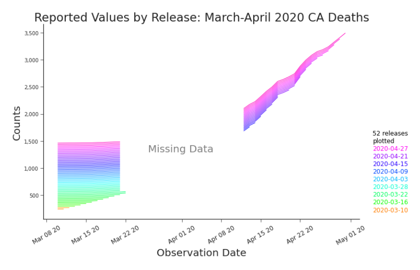
Figure 3.3. Shifted Line Plot: Cumulative Deaths in CA, March-April 2020 By ”shifting” the lines with a vertical offset, we can see consistency between releases as well as inconsistency, such as the initial reporting of values for March 20-22nd that disappear from subsequent releases.
Filtered Heat Maps
Shifted line plots are helpful when we know where to look, but in general we don’t. We often need to assess a larger set of releases than a shifted line plot can accommodate. For that, we’ve devised a few special types of heat maps. Heat maps allow us to explore the upper triangular matrix that holds our full set of releases. introduce xij notation.
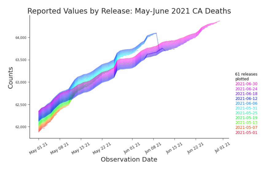
Figure 3.4. Shifted Line Plot: Cumulative Deaths in CA, May-June 2021 The shifted line plot enables us to see trends in releases and disagreements. By adjusting the transparency of the lines, the disagreement in reported values is highlighted. Of course, the number of releases able to be displayed at a time is limited. In Figure 3.5 the color codes cells according the the value reported, using c(i, j) = κ(xi, j )
where c(i, j) is the color of cell i, j and κ linearly maps (min xi, j , max xi, j ) to a continuum that stretches from blue (low) to yellow to red (high). A clear vertical line, like the one splitting the plot in Figure 3.5, indicates that a major restatement, a type of retroactive change, occurred. This type of change rewrites history. The vertical line in this heat map points us to the disagreement in the related shifted line plot in Figure 3.4. Just like shifted line plots, heat maps have their constraints as well. Signal can be quickly lost with extreme outliers, high variability, or many releases (Figure 3.6).
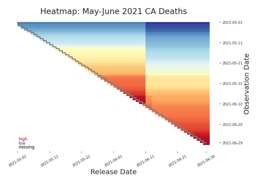
Figure 3.5. Heat Map: Cumulative Deaths in CA, May-June 2021 A heat map of the upper triangular release matrix can help identify trends in the data that may be of interest. Here we can see a vertical line cutting through the plot clearly, indicating a retroactive change. We can also see a faint horizontal ”cliff” where the color scale changes more suddenly.
Figure 3.5 revealed one retroactive change and there’s no reason to believe there aren’t more. To find them, we must highlight the between release differences. Rather than mapping the original values, we will map only those values that are restated between subsequent release. We’ll assign a color to the associated cell according to the size of the change. c(i, j) = κ(xi, j − xi, j−1 )
where κ(0) = white and κ(x) maps to a continuum of green for positive x and a continuum of red for negative x. We’ll call this a between release heat map.
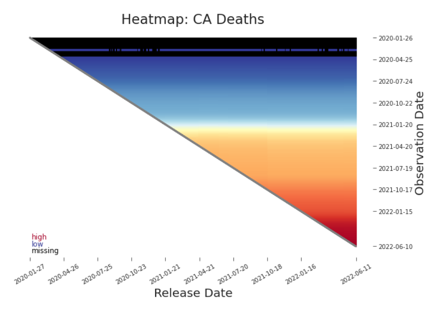
Figure 3.6. Heat Map: Cumulative Deaths in CA As the data scales, signal can easily be lost. Here, the range of values dominates the color spectrum. This forces differences between releases to be coded in imperceptibly close colors, erasing the vertical line we saw in the previous detail (Figure 3.5). As the data increases in size, it will be more effective to plot changes between releases (Figure 3.7) and within releases (Figure 3.11). Our assumption is often that values remain constant between releases, i.e. previously reported values are not restated. When that assumption holds, the between release heat map is a yawn of white. When there are revisions, as in Figure 3.7, we see vertical bars indicating total or partial restatements. These retroactive changes, when they nearly stretch from the diagonal bar to the top, are major restatements. They are of greatest concern. They indicate a near complete rewriting of history. They may render prior data (releases to the left of the vertical line) no longer relevant to analysis or modeling (Figure 3.8). In these cases, a change of data definition or production process may be the culprit.
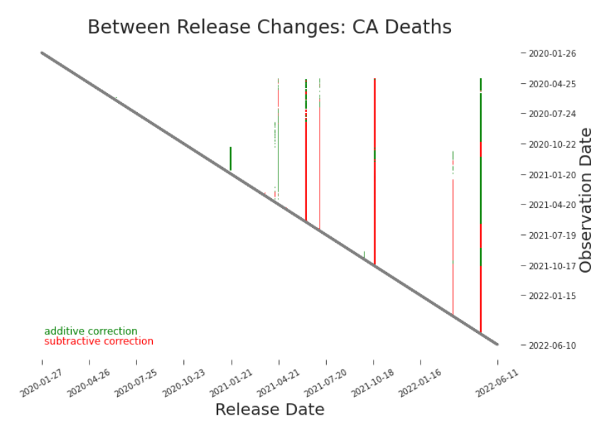
Figure 3.7. Between Release Heat Map: Cumulative Deaths in CA Each vertical line indicates a major restatement of previously reported values. Here, we can clearly see 5 releases that adjusted nearly all prior reporting. The impact of those adjustments requires further investigation.
With the right visualizations, retroactive changes are often easy to spot. But not all changes are made retroactively. For example, suppose new reporting requirements ask for a+b, but previously only a (and not b) was collected. Going forward, a + b will be reported, but the historic observation dates will always report a, including in new releases. We call this a non-retroactive change. Changes like this are often harder to detect but they are just as critical to understand. The challenge is differentiating a mere change in the data, such as a sudden surge in deaths, from a change to the data, such as a change that redefines deaths from those with covid to those from covid. Some changes to the data are more
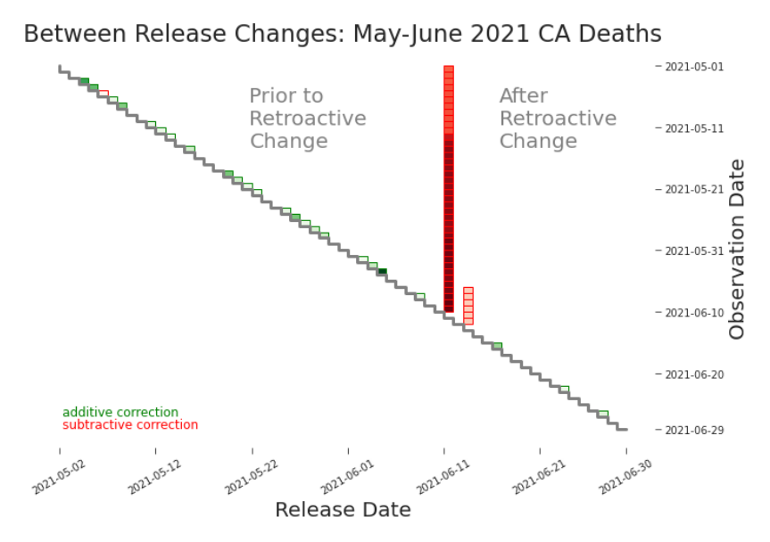
Figure 3.8. Between Release Heat Map: Cumulative Deaths in CA, May-June 2021 Depending on the nature of a restatement, we may consider the data reported after to be so different that it must be treated as a new data set. This may occur, for example, when a restatement indicates a major change in definition or data production process. In this case, training data should begin with the restatement, i.e. only the restatement (the vertical bar) and releases to the right of it. obvious. For instance, a decrease in cumulative deaths between subsequent observations is a good signal that something important has changed. In general, non-retroactive changes to data are not that glaring. Detecting non-retroactive changes via heat map is often even more difficult than detecting retroactive changes (Figure 3.9). However, unlike between releases, there is no assumption or null hypothesis that values will remain constant within a release. The expectation is, in general, that changes will occur within a release. We need to be choosy about which changes we plot. For cumulative counts, as recorded in our data, we could put in the simple
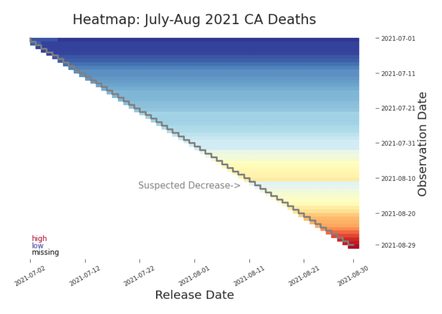
Figure 3.9. Heat Map: Cumulative Deaths in CA, July-August 2021 A misplaced faint blue horizontal line indicates a decrease in what ought to be a cumulative count. constraint that we only plot decreases. Specifically, any cell associated with an xi, j such that xi, j < xi−1, j is mapped to the red spectrum and all else remain white. The resulting plot (Figure 3.10) is informative, though it may be overly sensitive to minor reporting corrections.2 But, we have no reason to believe that nonretroactive changes would only be subtractive. We need a constraint that will respect both sides of the problem. A simple but effective option3 k=i−1
highlights possible non-retroactive changes in both directions (Figure 3.11). In the detailed view in Figure 3.12 we’ve found one of each. When we find a potential non-retroactive change (NRC) in a within release heat map,
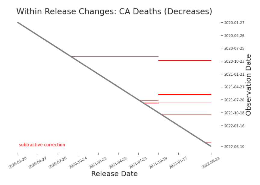
Figure 3.10. Within Release Heath Map: Cumulative Deaths in CA Negative cumulative deaths is a good indication of a revision. That revision may be a minor correction ineloquently executed or a major change in the data definition or production process. we can explore it using a shifted line plot (see: Figure 3.13). The identified subtractive NRC appears clearly in a shifted line plot, although the possible additive change is not much more than a kink.
Lag Plots
Not all data revisions are changes to the production process or data definition. Some revisions are expected and are essentially part of the data production process. Economists have long recognized that some data, like gross domestic product (GDP) data, is often released provisionally and is expected to be
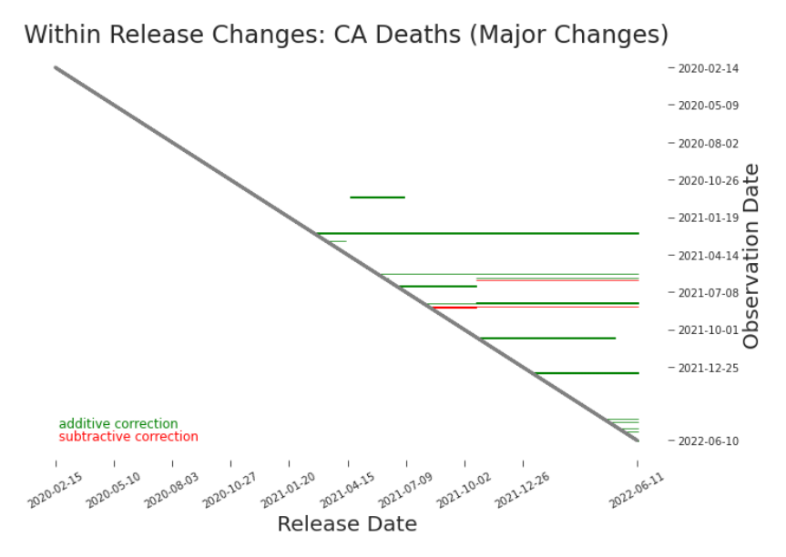
Figure 3.11. Within Release Heat Map: Cumulative Deaths in CA Horizontal lines may indicate a non-retroactive change. They point out uncharacteristic shifts, as defined by the parameters of the plotting algorithm. A green line might indicate a dramatic yet true surge. It may indicate a major change to data production process. A red line might indicate a minor adjustment. Or it may indicate a significant change to the data definition. Whether green or red, further investigation is needed to understand what occurred and its significance to the fitness of the data (Figure 3.12, Figure 3.13). These changes are plotted according to the constraint in Equation 3.2.3. updated at some later date when all underlying data is available.4 Out of deference to their work, we’ll refer such changes as provisional changes. We’ll use provisional data or preliminary data to refer to initial values that are anticipated to change. We can see provisional changes visualized as the green cells marching up the ”staircase” in Figure 3.8. To understand provisional changes and other trends in revisions, we can define a particular scatter plot. By plotting the days after the observation date that
We’ll discuss this further in Section 4.4.3.
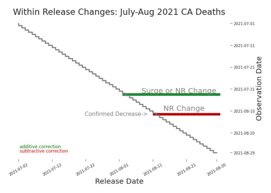
Figure 3.12. Within Release Heat Map: Cumulative Deaths in CA, JulyAugust 2021 Cumulative deaths should never go down. A red horizontal line, as we see here, indicates an NRC. To understand its impact, we continue to explore (Figure 3.13). a change is made against the observation date, provisional changes appear as horizontal lines (Figure 3.14). Retroactive changes now appear as diagonal lines (Figure 3.15). Nonretroactive changes, which do not restate previous values, do not appear in lag plots (Figure 3.16). These lag plots tell us more than just what kind of revision occurred. By using color and size to our advantage, we can explore what happened within these change. For example, in Figure 3.15 we see small, predictable, and largely addition provisional changes. This is what we’d expect if, say, a county in California was routinely late in submitting their data. We can also hypothesize as to the type of retroactive change. In Figure 3.14 we see a mostly magenta diagonal line, which may indicate the introduction of a more conservative data
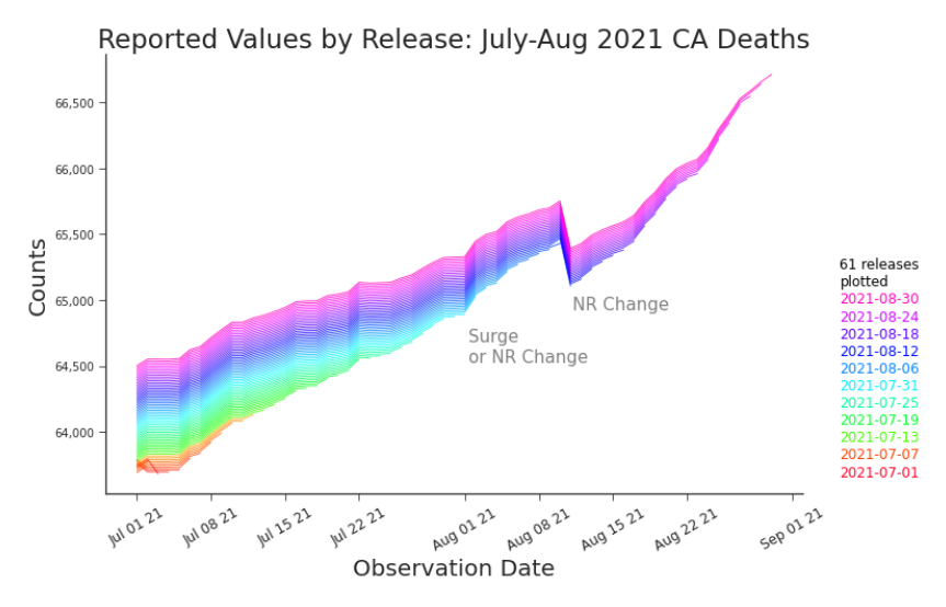
Figure 3.13. Shifted Line Plot: Cumulative Deaths in CA, July-August 2021 Diving into the detail of late summer 2021, we see the cumulative deaths plummet where at the same observation we saw a red horizontal line at in Figure3.12. However, the green line there is only associated with a small bump here, possibly indicating it was indeed a surge and not an NRC after all. The best option, of course, is to check with the data producers and the subject matter experts.
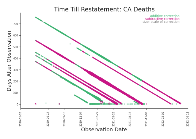
Figure 3.14. Lag Plot: Cumulative Deaths in CA Provisional changes are easily seen in a lag plot–even as data scales. In a between release plot, they disappear as the data grows larger (Figure 3.7).
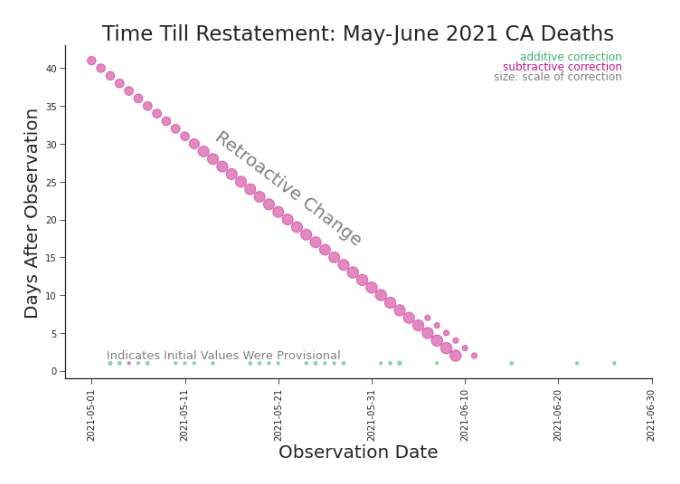
Figure 3.15. Lag Plot: Cumulative Deaths in CA, May-June 2021 The retroactive change we saw in Figures 3.4) and 3.8 is still prominent, but now we can easily identify the provisional changes. too. definition. (This would, of course, need further confirmation.)
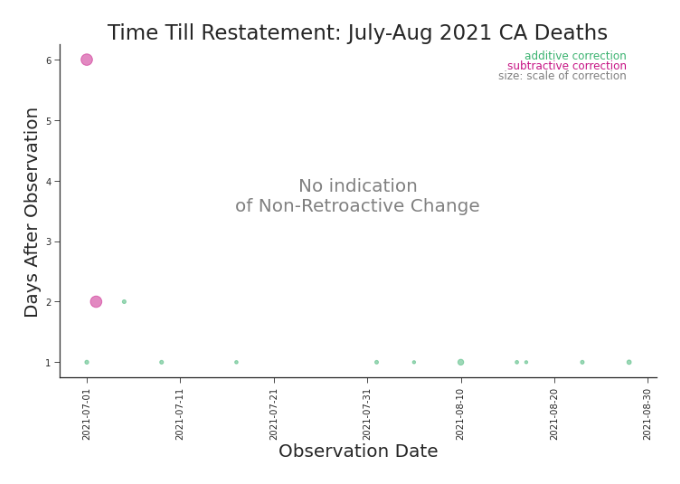
Figure 3.16. Lag Plot: Cumulative Deaths in CA, July-August 2021 A nonretroactive change, by definition, does not revise previously reported values. As such, NRCs won’t appear on lag plots.
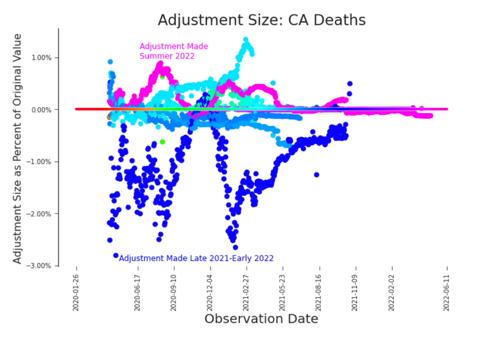
Figure 3.17. Bifrost Plot: Cumulative Deaths in CA Bifrost plots enable all changes to be shown simultaneously, revealing revision trends in nearby releases.
Bifrost Plots
Visually stunning and surprising useful, the bifrost plot reveals trends in the scale of revisions. We named it after the mythic burning rainbow bridge that connects Earth and Asgard. One look at Figure 3.17 and it’s easy to see why. The ”rainbow bridge” which crosses the plot horizontally acts as a legend. It color-codes the scatter plot, connecting the date of observation and the date of revision. For example, dark blue dots indicate that a value was adjusted in a release near the end of 2021 or early 2022. Magenta dots indicate an adjustment made in a summer 2022 release. In bifrost plots we can explore high level trends in and the scale of revisions (Figure 3.17). Bifrost plots are also adept at displaying detailed trends. In Figure 3.18 we can see a clear temporal trends in July’s adjustments. It’s always advisable to look at the impact of data revisions and changes on both the raw data and our transformation of it. In the case of COVID-19, it’s common to look at the daily (net new) deaths or a 7-day rolling average of daily deaths. A bifrost plot of the daily deaths, Figure 3.19, shows that these restatements are both significant in scale and do not present a trend with respect to daily death counts. With no pattern to predict or rely upon, this plot raises real concerns about modeling with this data.
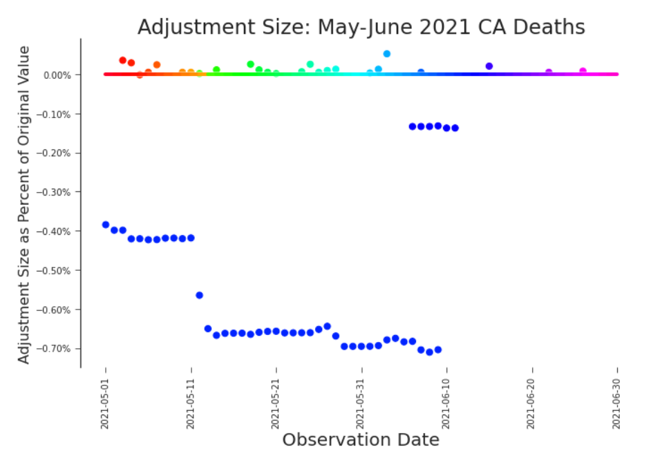
Figure 3.18. Bifrost Plot: Cumulative Deaths in California, May-June 2021 The impact of the changes visible in Figure 3.2 and Figure 3.15 become immediately apparent in a bifrost plot.
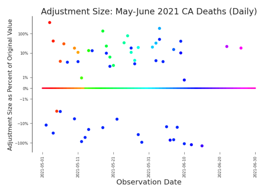
Figure 3.19. Bifrost Plot: Daily Deaths in CA, May-June 2021 When transforming data, it’s important to consider the impact not only to the raw data (Figure 3.18), but the data will actually be used (here and Figure 3.20). The differences between which can be quite dramatic. It would be hard to imagine that the scale of adjustments to this data would not severely limit modelling efforts.
Impact Plots
Finally, or possibly firstly, we care about the impact to our application. The most important question is, of course, do these changes really matter? Minor corrections may be little more than noise and not bear any real weight on how we can or should use the data. Plotting the difference between the first reported values and the last release visualizes the impact succinctly (Figures 3.21 and 3.22). If the changes to data are consistent or predictable, we’d expect a pattern.
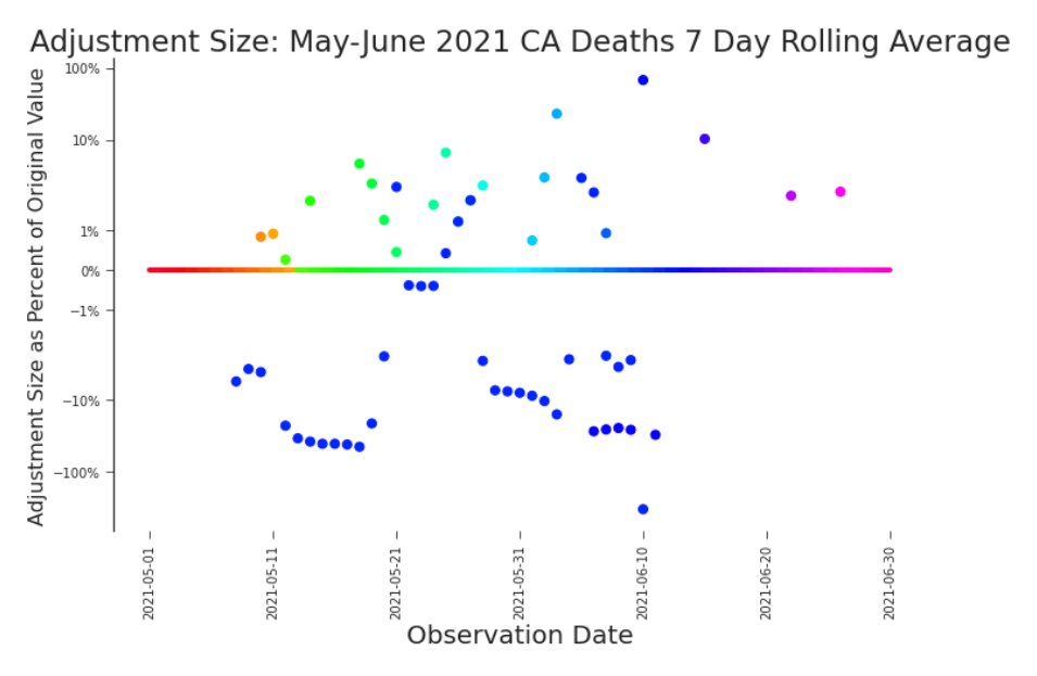
Figure 3.20. Bifrost Plot: 7-Day Rolling Average of Daily Deaths in CA By exploring the changes to this data transformation, we see trends that appeared in neither the raw data nor the daily deaths (Figure 3.19). We’d expect it to impose different limitations to our modelling efforts. There is nothing particularly special about the last release we consider. It does not represent a final version of the data or the completion of the pandemic. When we gathered this data the pandemic was still ongoing, our response to it was still evolving, and the data production process was still churning. Instead of looking at the last release we happen to have, we ought to look at releases that are particularly important. Here we’ve filtered releases into those that are identified as major restatements. In these plots we’ve defined the criteria for a major restatement as a release in which at least 20% of previously reported values were adjusted. We’ve plotted the size of the adjustment to the previously reported (not original) value. Impact plots, as we’ve termed these specifications of area plots, provide a
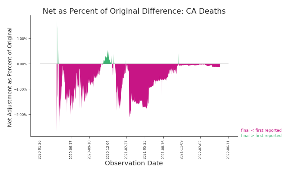
Figure 3.21. Impact Plot: Daily Deaths in CA, Final versus First Reported Although superficial in its detail, plotting the first reported values against the final values can quickly indicate that changes have indeed occurred–and not in a clear and organized fashion.
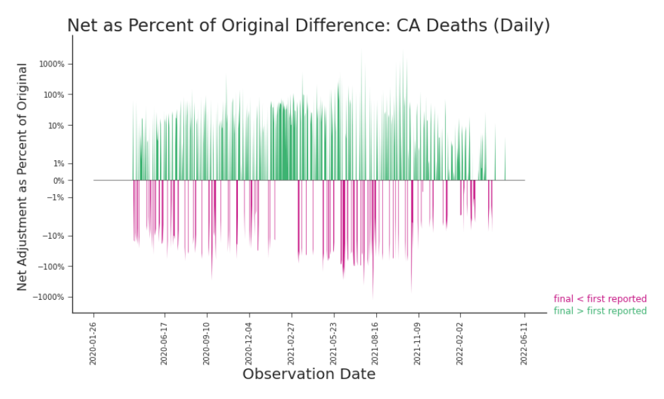
Figure 3.22. Impact Plot: Daily Deaths in CA, Final versus First Reported The impact of adjustments to transformed data can be much different than their impact on the raw data (Figure 3.21).
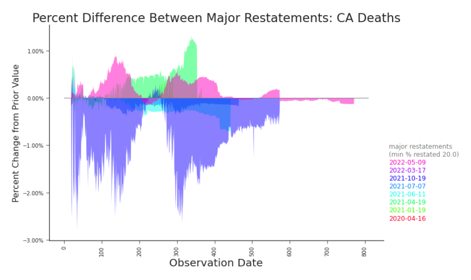
Figure 3.23. Impact Plot: Cumulative Deaths in CA, Final versus First Reported The impact to the raw data may be quite different in both shape and scale to the impact to transformed data. Here, the revisions to cumulative counts appear contained, whereas most applications use daily counts (Figure 3.24) or a 7 day rolling average of daily counts (Figure 3.25). filtered insight into their associated bifrost plots (e.g. Figure 3.23 and Figure 3.17). It’s important to consider them in conjunction. Impact plots highlight single releases that rewrite large portions of history. But not all major revisions are made in one release. Some roll out over the course of a few releases, as upstream data producers adjust to new production processes or data definitions in their own time.
Laying Groundwork
We’ve introduced retroactive changes, non-retroactive changes, provisional changes, and major restatements. There are far more ways that data changes over subsequent releases, but these form a strong foundation
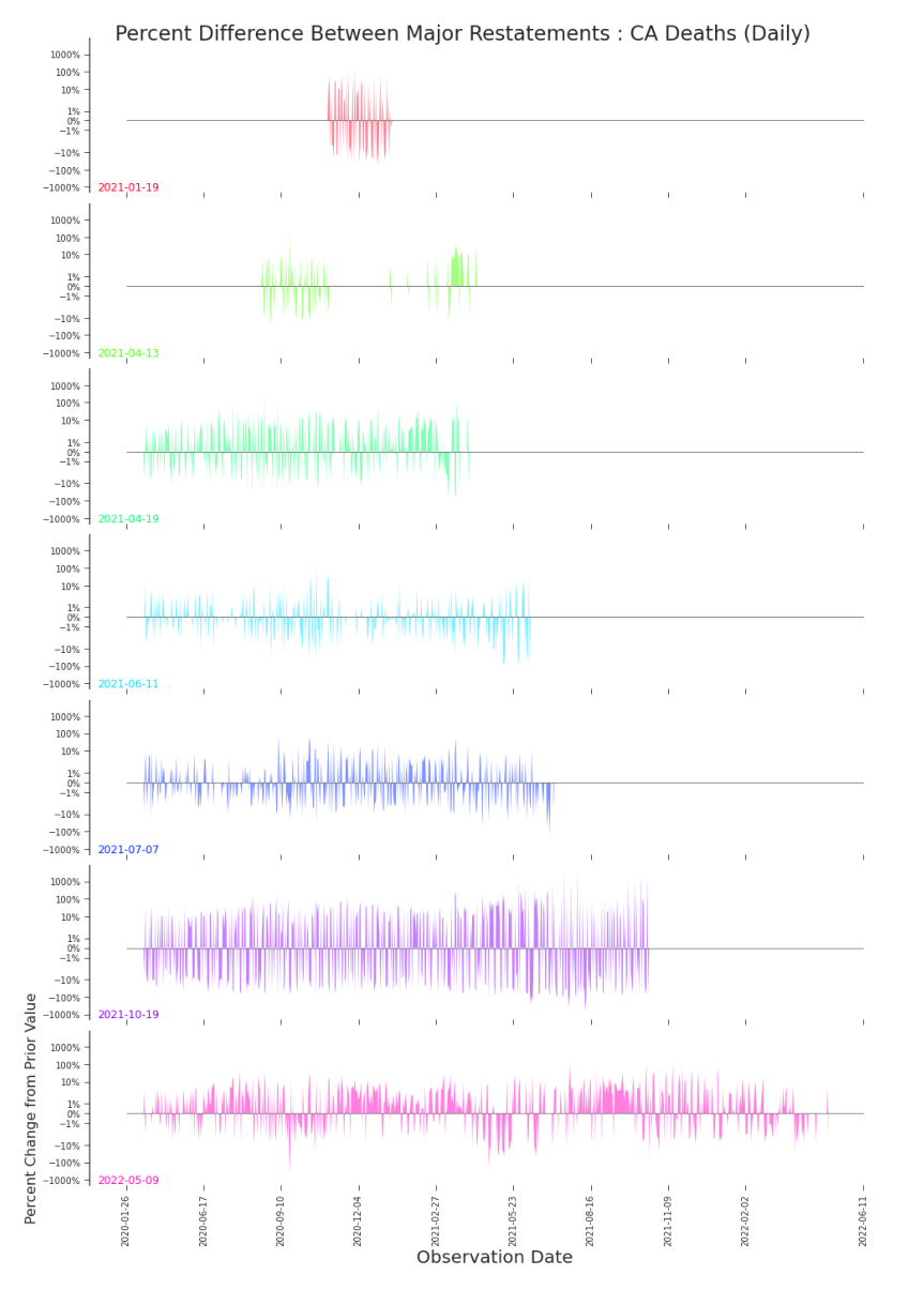
Figure 3.24. Impact Plot: Daily Deaths in CA, Major Restatements Small multiples help tease apart volatile revisions. Adjustments to daily counts are clearly significant in relative size, but apparently without pattern.
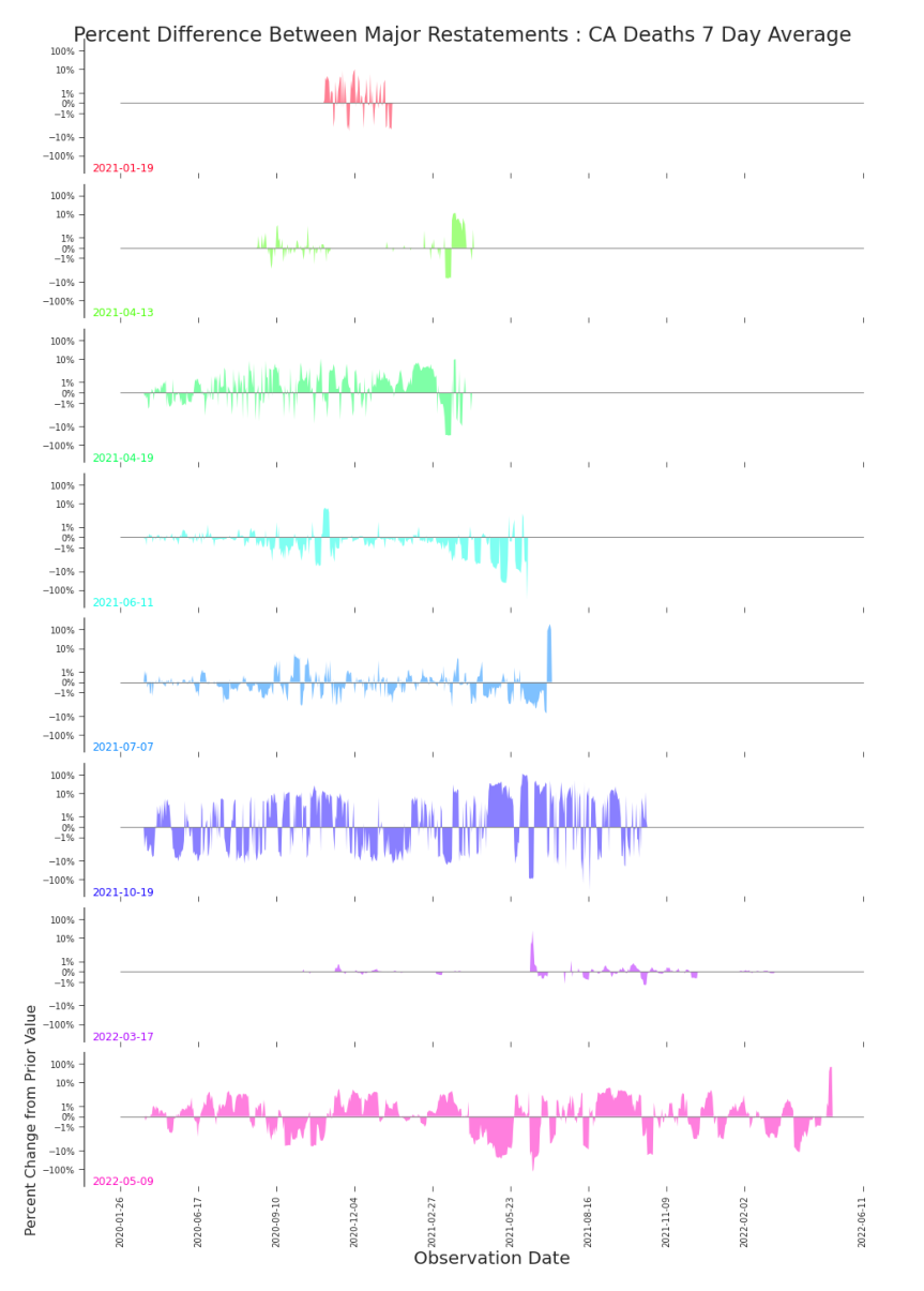
Figure 3.25. Impact Plot: 7-Day Rolling Average of Daily Deaths in CA, Major Restatements The 7-day rolling average daily deaths is a popular transformation for predictive modelling. It’s hard to imagine a model that could effectively predict the pandemic’s evolution that did not first accommodate the data’s evolution. on which we can build our discussion of America’s COVID-19 data. These kinds of revisions and data changes are by no means the limited to COVID-19 data, public health data, or public data in general. These represent common challenges in modern data that, when not accommodated, stymie statistical and machine learning models. By building a vocabulary and proposing common visualizations, we hope to inspire discourse, research, and adjustments to modeling practice. There is much work to be done in the field of data quality. And the need is urgent.
Notes
-
In this chapter, we will use xi,j notation for convenience. In subsequent chapters we will adopt more precise notation.
-
When reporting tens of thousands of deaths, a previously reported value adjusted by one or two deaths may not concern us too much.
-
A more satisfying constraint is proposed in Section 7.2.1.